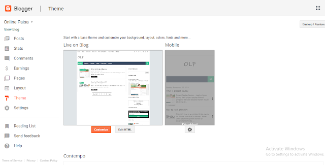
How to Enable Mobile Template in Blogger
By default Blogger site through Smartphones or tablets it automatically displays the full desktop version of your website, instead of showing the Mobile responsive template. The full desktop version is not designed for portable devices like smartphones, iPad and tablets. Blogger offers some free-to-use built-in mobile responsive templates that do the job quite brilliantly. Therefore, this article, we will show you How to Enable Mobile Template in Blogger.
Use Mobile Template
Your website is getting all of its traffic from mobile devices. In this situation, tracking the operating system of your visitors through Google analytics comes handy because if 90% of your audience is access your site through portable devices, then it is extremely crucial to enable a Mobile template for your site.
Other, 5% visitors are accessing your site through Mobile devices, mobile devices because the majority of users are arriving on your site through desktops.
Solution
Go to Blogger -Template - Mobile - Select the wheel as shown in the below and it will take you to a new page from where you would enable the responsive template for mobile users.
 |
| how to install blogger template |
Just select “Yes. Show mobile template on mobile devices”. Through the drop down list, you can select from different templates according to your needs
After selecting a theme, you would surely desire to preview what your visitors would see whenever they visit your site through their phones. Select the “Preview” button and it will exactly display your site as you are navigation it from portable device.
Previewing the themes if it satisfies your needs then, go ahead and press the “Save” button to conclude. Now whenever, visitors will try to access your site through portable devices i.e. Smartphones or tablets it will automatically show them a mobile responsive version of your website.
 |
| how to install blogger template |
After selecting a theme, you would surely desire to preview what your visitors would see whenever they visit your site through their phones. Select the “Preview” button and it will exactly display your site as you are navigation it from portable device.
 |
| blogger templates responsive |
Previewing the themes if it satisfies your needs then, go ahead and press the “Save” button to conclude. Now whenever, visitors will try to access your site through portable devices i.e. Smartphones or tablets it will automatically show them a mobile responsive version of your website.
See Mobile User
Those visitors who arrive on your blog through Desktops (PC, laptops, Mac Books and etc) would not notice anything different. The website would continue to behave the way it used to be. However, those Readers who will access your site through Smartphones or tablets would see a different view. Following are the list of things that would not appear in the mobile version.
- No Sidebar.
- No gadgets.
- No Navigation Menu.
- On the homepage it will display Post Title, a Small Thumbnail and Post Summary with a read more button.
- At the bottom of the page, there are few navigation buttons for older/newer posts.
In the footer, there is a link. "view web version" which will allow mobile users to view the full desktop version of a website within their portable devices. However, on reloading the page, it will revert back to the mobile version.


No comments:
Post a Comment